I am a backend developer. I have spent fourteen years on PHP, Laravel, queues, and AWS bills. I cannot design. I know when a page looks off, but I have no idea why, and my fixes usually make it worse. So when I installed the taste skill bundle for Claude Code on this site, I expected a few nicer buttons and a lot of purple.
What I got was a redesign I would not have been able to describe, let alone build. It also turned up a real dark mode bug that had been shipping to every visitor whose operating system was set to dark mode.
This post covers what the taste skill is, what it changed on richardporter.dev, and the bug. Everything here comes from the actual commits in PR #53, so the numbers are real.
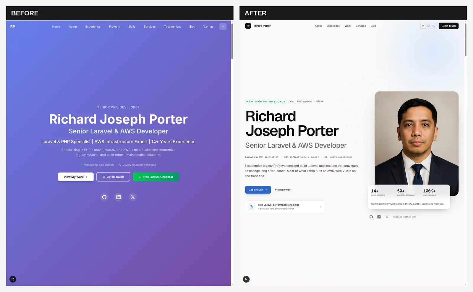
The old design was mine, and it showed
Look at the left side of that image. That is the homepage I built and was, for a while, proud of. A purple gradient covering the full screen. My name centered in huge white type. Three buttons in three different styles competing for the same click. A navigation bar with nine items, because nearly every homepage section got its own link.
Below the fold it got worse. My skills section had percentage bars where I rated myself: PHP at 95%, Python at 75%. Nobody has ever hired a developer because they graded their own PHP out of 100. The contact form had a progress bar and confetti. There were ripple effects, shimmer sweeps, and numbers that counted up when you scrolled to them.
None of it looked broken, exactly. It just looked like a template a backend developer picked because it had a lot of features. Which is what it was.
What the taste skill actually is
The taste skill is a collection of Claude Code skills published at Leonxlnx/taste-skill on GitHub. A skill is a Markdown file of instructions that Claude Code loads when a task matches its description. This bundle is all about frontend design. It includes:
design-taste-frontend, which describes itself as an "anti-slop frontend skill" for landing pages, portfolios, and redesignsredesign-existing-projects, which audits an existing site first and then fixes it with the stack you already haveminimalist-ui,high-end-visual-design,industrial-brutalist-ui, and a few other style directionsbrandkit,image-to-code, and image generation skills I did not end up needing
I installed the whole thing in one commit. The skill files live in .agents/skills/, with relative symlinks in .claude/skills/ so Claude Code picks them up. Each version is pinned by hash in skills-lock.json:
"design-taste-frontend": {
  "source": "Leonxlnx/taste-skill",
  "sourceType": "github",
  "skillPath": "skills/taste-skill/SKILL.md",
  "computedHash": "899b84384f74f540ea5284d9b2e9234e050998b42eacc805410b518d4226c0b3"
}
That install commit alone added about 6,900 lines, almost all of it Markdown. These are not tiny prompts. The main design-taste-frontend skill is over 1,200 lines of rules about typography, color, spacing, and what makes a page look generated.
The part I noticed first is the audit-first approach. The redesign skill's own instructions are "Scan, Diagnose, Fix", and they say not to rewrite from scratch. That suited me. I did not want a new site. I wanted my site to stop looking like my site.
The dark mode bug a design pass found
This is the part I still think about. The first commit of the redesign was supposed to set up colors and fonts. Instead, its commit message opens with a bug report:
Tailwind v4 ignores
tailwind.config.js, sodarkMode: 'selector'never applied and everydark:utility compiled toprefers-color-scheme.
Here is what that means in practice. My site has a three-way theme toggle: Light, Dark, and System. The toggle works by adding a dark class to the <html> element. My Tailwind config told Tailwind to use that class:
// tailwind.config.js (the config Tailwind v4 never read)
module.exports = {
  darkMode: 'selector',
  // ...
}
But the site runs Tailwind v4, and v4 does not read tailwind.config.js unless you explicitly point your CSS at it. So that line did nothing. Every dark:bg-gray-800 and dark:text-white in my components compiled to a prefers-color-scheme: dark media query. They followed the operating system and ignored my toggle completely.
I added the theme toggle in July 2025, and the same commit shipped a "fix" for dark mode. It didn't find the cause. It patched the symptoms. The top of my old globals.css looked like this:
/* Force dark mode to use class selector instead of media query */
@media (prefers-color-scheme: dark) {
  .dark\:bg-gray-900 {
    background-color: transparent !important;
  }
  .dark\:text-white {
    color: inherit !important;
  }
  /* ...eight more like this */
}

/* Proper dark mode using class selector */
.dark .bg-white {
  background-color: oklch(21% .034 264.665); /* gray-900 */
}
So there were two dark modes fighting each other. The dark: utilities followed the OS. A hand-written layer of 64 .dark .something override rules followed the toggle. The media query block tried to cancel out the first system, but it listed ten classes, and the source code used about a hundred distinct dark: utilities.
The result: if your laptop or phone was set to dark mode, you could get white sections with white headings. Testimonial names disappeared the same way. The toggle still looked like it worked, because it flipped my override layer, which is probably why I never caught it. That patch went in on July 18, 2025. The fix landed on September 14, 2026.
It gets better. On that same July day I published a post on implementing dark mode with Tailwind CSS. Its setup starts with a darkMode entry in tailwind.config.js. That is Tailwind v3 advice, and this site has been on v4 since its first commit.
The fix is one line of CSS:
@custom-variant dark (&:where(.dark, .dark *));
That tells Tailwind v4 to drive every dark: utility from the .dark class. With that in place, the override layer and the media query hack were dead weight, so they got deleted along with about 40 effect classes nothing used anymore. globals.css went from 1,056 lines to 314.
This is why the whole thing surprised me. I asked for a design pass. The PR's test notes list Light, System, and Dark each checked under both OS light and OS dark, with persistence across a reload. That is the test I never ran. I clicked my own toggle on my own laptop and called it done.
One gray, one blue, and a real font
The rest of that first commit built what the skill calls a design system. For someone like me, the interesting part was how little code it needed.
Instead of touching every component, it overrode Tailwind's own gray and blue scales inside @theme:
@theme static {
  /* One warm-graphite neutral family */
  --color-gray-50: oklch(98.5% 0.002 75);
  --color-gray-500: oklch(55.6% 0.009 66);
  --color-gray-950: oklch(17.2% 0.004 60);

  /* One desaturated cobalt accent */
  --color-blue-500: oklch(61.8% 0.155 260);
  --color-blue-600: oklch(52.8% 0.165 261);
  /* ...the full 50-950 range for both */
}
Every existing text-gray-600 and bg-blue-600 on the site now pointed at the new palette. The grays got a slightly warm tint, which the code comment says was chosen to match the greige backdrop in my headshot. I would never have thought of that. Green and red were kept for status messages only. The purple, pink, cyan, and orange gradients are gone from the whole site.
Other changes in that commit:
- Inter was replaced with Geist, plus Geist Mono for dates, numbers, and labels
- A default keyboard focus ring and a selection color that match the accent
text-wrap: balanceon headings so titles don't end with one lonely word- My custom
pulseandbouncekeyframes were removed, because they had been silently overriding Tailwind's built-inanimate-pulseandanimate-bounce - A shared
SectionHeadingcomponent, so every section header looks the same - The favicon, Apple icon, and OG image retuned to the new colors
That keyframes one is another bug I didn't know about. I had defined animations with the same names as Tailwind's and broken the originals.
What changed on the homepage
The homepage commit is where the before/after image above comes from. The hero went from centered text on a gradient to a left-aligned layout with my portrait and a small stats card overlapping it. One primary button ("Get in touch") replaced the three competing ones. The free Laravel checklist moved to a quieter row underneath.
The rest of the page got the same treatment:
- Skills now show years of use instead of self-rated percentage bars
- Projects are alternating rows in browser frames with plain "Built for / Focus / Stack" facts. Filler copy like "Unlimited Business Growth" is gone.
- The FAQ is always visible instead of hidden in an accordion, with the same text and the same FAQPage schema
- Testimonials became one featured quote plus two smaller ones
- The navigation went from nine items to five plus a "Get in touch" button, and the theme toggle became a Light/System/Dark segmented control
It found more bugs along the way. The old theme toggle was white on white on inner pages before you scrolled. The logo didn't link home. There was no custom 404 page.
The contact form one is my favorite. When you left a field, validation inserted an error message, which pushed the layout down. If you clicked Submit right then, the button moved between mousedown and mouseup, and the click never registered. Someone could fill out my contact form, click Submit, and have nothing happen. The fix positions the errors so the form doesn't move. The progress bar, confetti, and shake animation were removed too.
Two custom hooks, useScrollReveal and useCountUp, were deleted because nothing used them anymore. Leaving out the skill bundle itself, the redesign code touched 51 files with 3,633 lines added and 4,355 removed. It deleted more than it added. I have spent years telling clients that the best legacy refactors look like that, and apparently I needed an AI design skill to apply the advice to my own site.
The blog listing and post pages
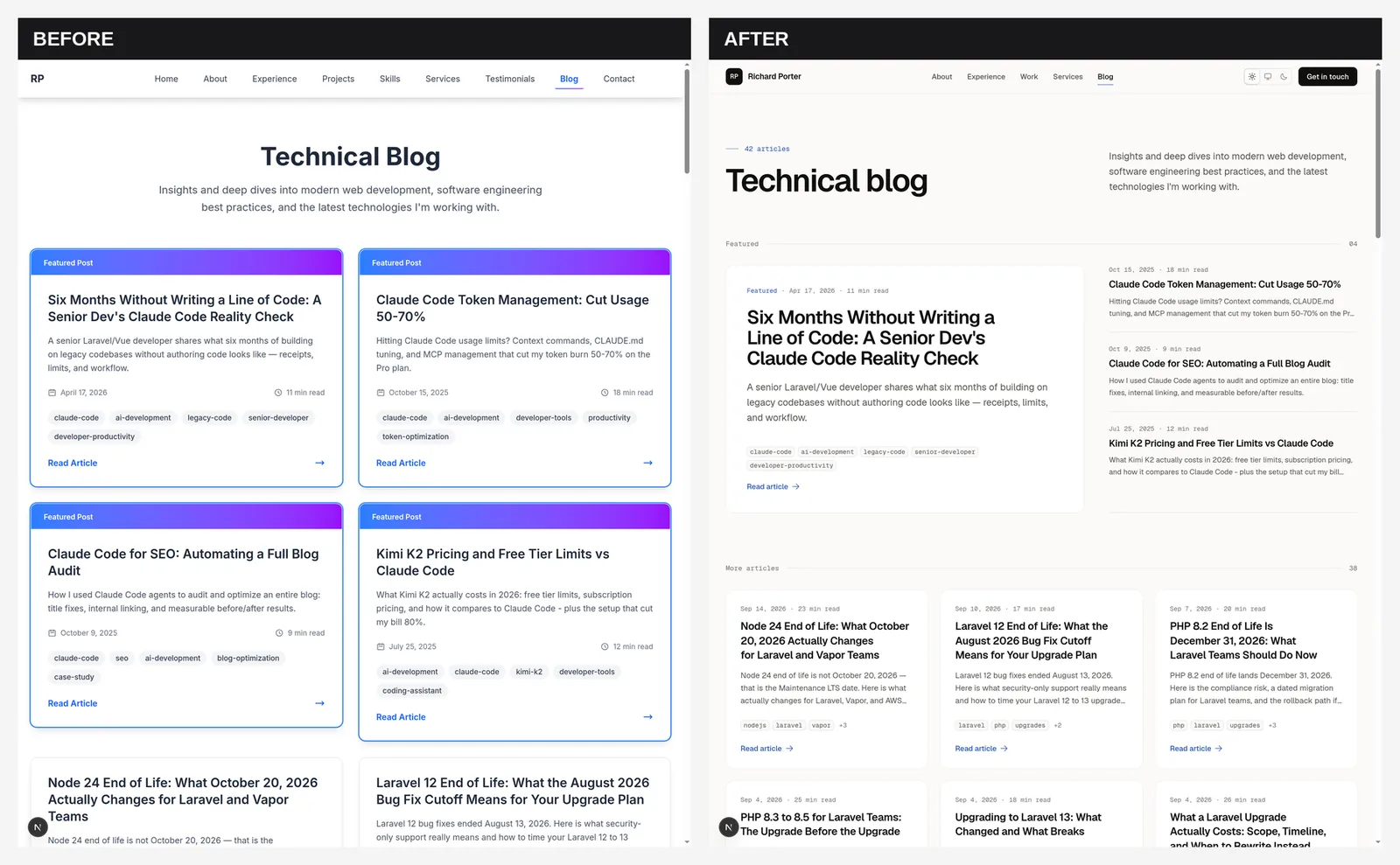
The old blog listing had "Featured Post" cards with a purple-to-blue gradient header on every single one. When everything is featured, nothing is.
The new listing has one featured lead post with a short list beside it, then an aligned card grid using CSS subgrid, so titles and excerpts line up across cards of different lengths. Tags are small neutral squares instead of rounded pills. Dates are now formatted in UTC, so a post's date can't shift by a day depending on time zone.
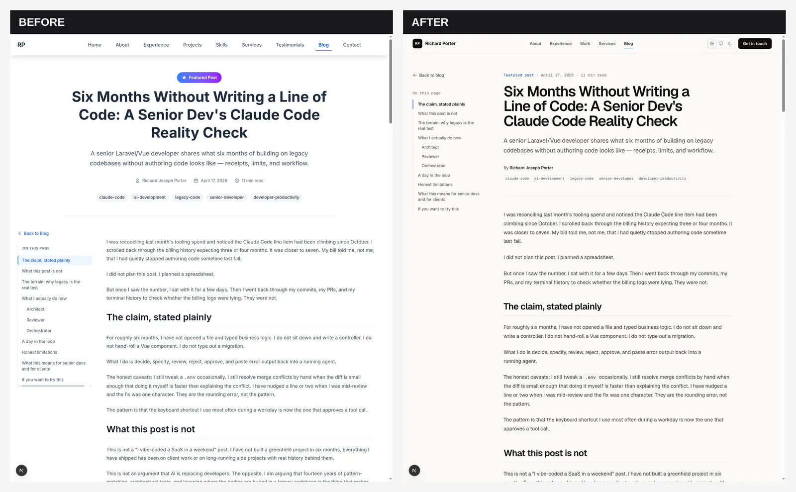
On post pages, the header, article, and previous/next links now share one reading column next to the table of contents, rather than a centered header floating above a two-column body. Code blocks are graphite, the "key takeaway" callouts use a light tint of the accent color, and the reading progress bar animates with a scaleX transform.
One honest detail from that commit: @tailwindcss/typography isn't actually loaded under Tailwind v4 either, the same config problem as dark mode. Blog posts are styled by the BlogContent component's own CSS, and the redesign retuned that CSS to the new palette instead of ripping it out. That was the right call. The skill's rule about working with the existing stack showed up in small choices like this all through the PR.
The services page, the Laravel and AWS guides, and the local landing pages got the same system in two more commits. The AWS guide had its own orange and yellow theme, which is now the shared accent. The lead magnet modal was moved into a portal, got a focus trap, and had its aria-labelledby fixed. It had been pointing at an id that didn't exist.
The numbers
Here is the full range from the install commit to the merge, straight from git diff --shortstat:
$ git diff --shortstat f71ac72^ 937b111
 79 files changed, 10520 insertions(+), 4355 deletions(-)
About 6,900 of those insertions are the skill bundle's Markdown. The redesign is seven commits: the install, a design foundation, then one each for shared layout, homepage, services, blog, and guides. I installed the bundle a little before 8pm on September 14, and the pull request was open before 9:30 the same evening. The PR description lists tsc, ESLint, and a production build passing, plus headless Chrome screenshots at 1440, 1024, and 390 pixels in light and dark.
What I took away from it
I expected the taste skill to make the site prettier. It did. What I didn't expect was how opinionated it would be, in exactly the places where I have no opinions. One accent color instead of five. Years of experience instead of made-up percentages. I could have agreed with any of that if someone had said it to me. I would never have said it to myself.
It didn't replace judgment. The PR ended with a list of things for me to check: copy it had rewritten, an email address that didn't match the rest of the site, and a few older content questions it flagged instead of changing. That list was the useful part. Reviewing it took the kind of attention I already give to backend PRs.
If you are a backend developer with a portfolio you quietly dislike, this is worth an evening. Review the diffs the way you would review any other PR. I wrote about that review-first habit in six months without writing a line of code, and the same habit applies here. And if your change is bigger than a redesign, pair a skill bundle like this with a planning workflow such as the Superpowers plugin for Claude Code.
I still can't design. But I can now tell you why my old homepage looked off, and that is more than I could say a week ago.

Written by
Richard Joseph Porter
Senior Laravel Developer with 14+ years of experience building scalable web applications. Specializing in PHP, Laravel, Vue.js, and AWS cloud infrastructure. Based in Cebu, Philippines, I help businesses modernize legacy systems and build high-performance APIs.
Get in touchLooking for expert web development?
With 14+ years of experience in Laravel, AWS, and modern web technologies, I help businesses build and scale their applications.
Related articles
11 min read
Six Months Without Writing a Line of Code: A Senior Dev's Claude Code Reality Check
A senior Laravel/Vue developer shares what six months of building on legacy codebases without authoring code looks like — receipts, limits, and workflow.
- claude-code
- ai-development
- legacy-code
10 min read
Claude Code Remote Control: The Untethered Developer
How Claude Code Remote Control lets you continue local coding sessions from your phone, tablet, or any browser. Setup guide with real workflow scenarios.
- claude-code
- ai-development
- developer-tools
12 min read
Claude Code Agent Teams: Parallel AI Development
How Claude Code Agent Teams coordinate multiple AI instances for parallel development across Laravel, Vue.js, and AWS. Setup guide with real-world workflow examples.
- claude-code
- ai-development
- developer-tools